| Pages in topic: < [1 2 3] > | New, more dense, list of KudoZ questions (Other info to include?) Thread poster: Henry Dotterer
|
|---|
Alison MacG 
United Kingdom
Local time: 10:01
German to English
+ ...
Henry, when I replied to your original post, saying that the revised version was a definite improvement (and I meant it), only Option 1 "stack" was offered. You added Option 2 "grid" later (and too late for me to edit my reply).
For me, Option 1 is much better than Option 2. All Option 2 does is space all the elements out even further so that they fill the entire screen. A concentrated strip of empty space to the right of a dense column display is a much better compromise for desktop users.
| | | | | Thanks, Alison | Feb 3, 2020 |
Alison MacG wrote:
For me, Option 1 is much better than Option 2. All Option 2 does is space all the elements out even further so that they fill the entire screen. A concentrated strip of empty space to the right of a dense column display is a much better compromise for desktop users.
Thanks for this clear feedback! Let's see what others think.
| | | | Yolanda Broad
United States
Local time: 05:01
Member (2000)
French to English
+ ...
MODERATOR | Input from granddaughter | Feb 3, 2020 |
My granddaughter Aurora (French student) tells me the new view is clearer than the old one.
| | | | | Thanks, Yolanda! | Feb 4, 2020 |
Yolanda Broad wrote:
My granddaughter Aurora (French student) tells me the new view is clearer than the old one.
 Thanks for asking her! Thanks for asking her!
| | |
|
|
|
| Stack and grid are identical on my computer | Feb 4, 2020 |
Henry,
The two links you provided display the list exactly the same way for me. Filling the entire screen, and I don't like it. I have to actually move my head to be able to see everything. The old display is much easier for me to scan, everything is smaller and I can see much easier if there is anything that I want to open.
I am using Windows 10 on a laptop wide-screen monitor, (1920 x 1080 resolution) with Firefox. I have 125% scaling set.
Just to check, I tried on my other e... See more Henry,
The two links you provided display the list exactly the same way for me. Filling the entire screen, and I don't like it. I have to actually move my head to be able to see everything. The old display is much easier for me to scan, everything is smaller and I can see much easier if there is anything that I want to open.
I am using Windows 10 on a laptop wide-screen monitor, (1920 x 1080 resolution) with Firefox. I have 125% scaling set.
Just to check, I tried on my other external monitor, which is 1366 x 768, and has 100% scaling set. Same thing, they look identical (and horrid - for me).
[Edited at 2020-02-04 18:27 GMT] ▲ Collapse
| | | | | Thanks, Katalin! | Feb 6, 2020 |
Katalin Horváth McClure wrote:
... Filling the entire screen, and I don't like it.
Thanks, Katalin. That's two people who commented here, and the number "sticking" when they try the new design may have dropped. We'll do something with that.
| | | | Samuel Murray
Netherlands
Local time: 11:01
Member (2006)
English to Afrikaans
+ ...
I'm late to the party, but both options look identical to me, even if I scroll down the page, and even if I maximise my window or reduce it to the width of a phone. Identical. I double-checked the address field to see if, indeed, they have two different URLs.
Katalin Horváth McClure wrote:
Filling the entire screen, and I don't like it. I have to actually move my head to be able to see everything. The old display is much easier for me to scan, everything is smaller and I can see much easier if there is anything that I want to open.
To me it makes little difference, except that the search box (when expanded in the new version) does indeed stretch all the way from the one side of the window to the other, whereas in the old version all options are tightly packed together. As for the list, I prefer the new version. I only ever scan one column at a time, so it doesn't matter if the columns are small or large or whatever.
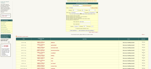
I took these screenshots (which I have reduced to 500 pixels wide) while the window was 2260x1030 pixels large. (I don't usually use the browser that large, however. 1400x1200 is the size I usually have my browser at.)
[Edited at 2020-02-06 07:35 GMT]
| | | | | Thanks, Samuel! Max width of list of questions is reduced | Feb 6, 2020 |
Thanks for the analysis, Samuel!
Henry Dotterer wrote: Katalin Horváth McClure wrote:
... Filling the entire screen, and I don't like it. Thanks, Katalin. That's two people who commented here, and the number "sticking" when they try the new design may have dropped. We'll do something with that.
The maximum width is reduced. I feel like it is an improvement. Let me know what you think.
| | |
|
|
|
| Is there any other info you would like to see shown in the list view? | Feb 6, 2020 |
As mentioned earlier in the thread, in the new KudoZ LIST page, we show several bits of information that were not shown in the list before. Is there any other information anyone would like brought into the list (so that it is not necessary to go to the individual question page to see it?)
| | | | | Am I right that we can no longer vote questions non-pro? | Feb 6, 2020 |
If so, that would be a sad loss. It would encourage people to post questions rather than doing their own research, and we would no longer have any way of politely suggesting that they use a dictionary.
| | | | Yolanda Broad
United States
Local time: 05:01
Member (2000)
French to English
+ ...
MODERATOR | See small arrow at bottom right of KudoZ query | Feb 6, 2020 |
philgoddard wrote:
If so, that would be a sad loss. It would encourage people to post questions rather than doing their own research, and we would no longer have any way of politely suggesting that they use a dictionary.
You are the second person who has wondered where a KudoZ function went. There is a little arrow at the bottom right of the box that holds the query. Click on that arrow for the dropdown menu that include the Pro/Non-Pro vote option.
However... it would be really helpful to the KudoZ community if those functions now included in a (very!) discreetly presented, unlabeled, dropdown menu were instead provided as directly available buttons, the way they used to be.
[Edited at 2020-02-06 22:52 GMT]
| | | | Matheus Chaud
Brazil
Local time: 06:01
Member
English to Portuguese
+ ...
MODERATOR | Leading answer - criteria | Feb 7, 2020 |
Henry,
I do like many of the new features, but one of them should be reconsidered, in my opinion: the method for ranking the answers proposed.
I agree with my colleagues that using the confidence level as one of the criteria is not a good idea.
It will certainly encourage answerers to raise their confidence level.
My thoughts on how to rank answers:
1) Net agrees
2) In case of a tie in net agrees, answers from experts in the field shoul... See more Henry,
I do like many of the new features, but one of them should be reconsidered, in my opinion: the method for ranking the answers proposed.
I agree with my colleagues that using the confidence level as one of the criteria is not a good idea.
It will certainly encourage answerers to raise their confidence level.
My thoughts on how to rank answers:
1) Net agrees
2) In case of a tie in net agrees, answers from experts in the field should appear first (then answers from people who work in the field, and last those from people who have an interest in the field)
3) In case the tie persists, just use the time information, as it used to be: the answer that was provided more quickly appears first.
It makes more sense, in my opinion, and it wouldn't motivate people to overestimate their confidence only to show up first in the list of answers. ▲ Collapse
| | |
|
|
|
| Thanks, Mateus. | Feb 7, 2020 |
Matheus Chaud wrote:
My thoughts on how to rank answers:
1) Net agrees
2) In case of a tie in net agrees, answers from experts in the field should appear first (then answers from people who work in the field, and last those from people who have an interest in the field)
3) In case the tie persists, just use the time information, as it used to be: the answer that was provided more quickly appears first.
Thanks, Matheus. Your suggestion gives me an idea for an adjustment.
I agree with my colleagues that using the confidence level as one of the criteria is not a good idea.
It will certainly encourage answerers to raise their confidence level.
Answers in the summary box have been sorted by confidence level for a long time, so this should already have happened. Has it?
| | | | Alison MacG
United Kingdom
Local time: 10:01
German to English
+ ...
Henry Dotterer wrote:
Answers in the summary box have been sorted by confidence level for a long time, so this should already have happened. Has it?
There is a difference between a) answers being sorted by confidence level in the summary box of an individual question where we can see all the proposed answers at once and judge them on their various merits for ourselves and b) only one possible answer being promoted on what is essentially the front page.
In KudoZ questions, as with translation in general, context is all-important.
Henry Dotterer wrote:
Seeing the proposed answer "Logical unit number" may help me to better judge whether or not I would have something to offer, or more generally, whether or not I want to visit that question.
and
Henry Dotterer wrote:
Is there any other information anyone would like brought into the list (so that it is not necessary to go to the individual question page to see it?)
I am surprised that you seem to want to discourage users from visiting another page of your site.
[Edited at 2020-02-07 14:19 GMT]
| | | | | That's right, Alison | Feb 7, 2020 |
Alison MacG wrote:
I am surprised that you seem to want to discourage users from visiting another page of your site.
Boosting page views has never been an objective here; to my thinking, providing information that saves people unnecessary page views is a good thing. (That's why we encourage detailed forum topic headings, and even re-write overly general ones, for example. Titles like 'You are not going to believe this!' are great for page views, but can be inconsiderate of other people's time.)
| | | | | Pages in topic: < [1 2 3] > | To report site rules violations or get help, contact a site moderator: You can also contact site staff by submitting a support request » New, more dense, list of KudoZ questions (Other info to include?) | Wordfast Pro | Translation Memory Software for Any Platform
Exclusive discount for ProZ.com users!
Save over 13% when purchasing Wordfast Pro through ProZ.com. Wordfast is the world's #1 provider of platform-independent Translation Memory software. Consistently ranked the most user-friendly and highest value
Buy now! » |
| | Anycount & Translation Office 3000 | Translation Office 3000
Translation Office 3000 is an advanced accounting tool for freelance translators and small agencies. TO3000 easily and seamlessly integrates with the business life of professional freelance translators.
More info » |
|
| | | | X Sign in to your ProZ.com account... | | | | | |